Tuesday 23 July 2013

How to Achieve a Responsive Design?


If you have a website that caters to online business, it is hard to ignore that web and mobile browsers are platforms your visitors are visiting your website. In case, if your website fails to perform on any of the platforms, your visitors may not come back. Many web development companies are aware of the fact that users browse websites on smart phones, tablets, PC’s and even TV yet their clients complain of their designs not being responsive.

What do you do then? Understanding what responsive design is will open up the stage further. Responsive design is displaying information on all devices in a more organized manner using modern tools and techniques. A single layout solution for designers can really be working.

High definition, low resolution etc, be whatever the capacity, these tips will help you design for better:

Keep it simple
: The first thing you should do is to keep your HTML code and layout as simple as possible. Test your design with experiments like removing CSS styling from your website and displaying it on other browsers. Your design is good, if your content can easily be read.

Get rid of
:
·         Purposeless Divs
·         Inline Styles
·         Useless Positioning Absolute or Float

What to use
:
·         HTML 5 Guidelines and doc type
·         A style sheet that resets
·         A simple layout

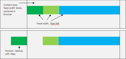
Note: Relying much on CSS3 or any other modern tricks may be a cause of concern for your website. Instead, keep the design simple. Below is an example of correct relative positioning.


Make use of Media Queries: Width conditions are critically important for a responsive design. Media queries can be used according to style and size. Besides, the clients width, you can load alternate style- sheet.

<style>
@import url(abc.css)(min-width:250 px);
@import url(def.css)(min-width:350px);
@import url(xyz.css)(min-width:450px);
</style>

Some examples according to the width are given below:

200px to 640px
@media screen and (min-width: 200px) and (max-width: 640px)
Above 640px, Landscape
@media screen and (min-width: 600px) and (orientation: landscape)
Less than 380px, portrait
@media screen and (min-width: 380px) and (orientation: portrait)

Categorize common resolutions: Common resolutions can be accommodated into 3 breakpoints:
  • Follow < 480px rule for first generation smart phone in a portrait mode
  • Follow < 768px rule for first generation smart phone in a landscape mode
  • Follow >768px rule for bigger tabs and desktops
Note: For desktops set the version above 1024px.

Are we finished yet? No, we are not! We will right back on the same blog. Keep reading for further tips on, How to achieve a responsive design?


Why people leave your website?


Converting a visitor into a potential customer is difficult. Customer retention is even more difficult. A good design would minimize confusion for the visitor and maximize interaction thus leading to visitor conversion. The success of the website depends on its usability, and utility, and not visual design. The decision to click any entity of choice rests with the visitor, who browses your website. Major influences to the websites come from user-centric designs.
These examples may be responsible for your website not having a user-centric design. If you are a website design company, you may want to look at these examples.

Improper Navigation
What puts the visitor’s attention off is the poor navigation of a website. When user finds it hard to navigate through your website, he may well leave the website. This indirectly would affect your search engine ranking because of higher bounce rates. The first law of Krug’s for usability states that WebPages must be self-explanatory and clear.

Avoid
:
·         Using unclear visual elements that confuse the user
·         Scattering main navigation links all over your website
·         Using main navigation links into the body
·         Using bad text for navigation links

What you can do
:
Make your navigation clear, concise, and easy to understand. For example, Sterco Digitex makes use of a navigation structure that is clear and concise.


If people cannot find their way around website, they are bound to leave. Adding a sitemap or grouping elements in a common area always helps.

Improper Content Structure  
If you have been experiencing low conversion rates, it might be a possibility that your site does not have a good content structure. The search ability of the user is very volatile; therefore, easy-to-find content supports the credibility and usability of your website. Some sections like contact info, should be easily accessible. It has been found that 50% of the conversions are lost because of poor content structure.

Avoid:
·         Complicating things by communicating your content on multiple pages. If your content can communicate the purpose on a single page, it would serve a better option.
·         Forgetting introductory content
·         Adding long paragraphs instead of crisp content with bullet points
·         Appropriate linking of pages-the other pages under each section must be linked with the current page and vice versa
·         Sitemap

What you can do
:
·         Introduce your web page through introductory content
·         Grouping content for easy navigation
·         Adding keywords, that visitors may be looking for. Using bold headings makes the content more readable.

Your design is boring
How many times you have visited a website and found it boring? The chances are 7 out of 10. A website that serves no purpose to the users is going to have tough times converting visitors to customers. In our blog, Interactivewebsites: Smart way of business promotion , it has been shown how user interactivity with the website affects your business.

Avoid
:
Making your website useless and plain as possible

What you can do
:
Updating fresh and unique content on regular basis not only benefits your search engine ranking but also builds reader base. Try including a blog section to your site and start blogging.

Poor Visual Language
A bad user experience happens because of bad typography, too much use of the typography, and sharp colors choice. It is a fact that colors are important elements of web design. Since mobile websites use light designs, the color themes may vary for mobile websites. Using sharp colors upsets the sites goal and sets off the user.

Avoid:
·         Using pixilated, complex and poor contrast typefaces
·         Using sharp and bright colors

What you can do
:
If you are looking for a professionally designed & developed website to leave a strong impact on your visitors, you must get it done by an expert webdesign & development agency .Choosing the right typefaces affect your conversions. For example if Sterco uses inefficient typefaces, the design would entirely upset your eyes. 
The above example shows user-experience based on the typeface of both the images. The original image validates the fact that typeface augment the user-interaction. While the image after changing will definitely encourage the user to leave.