Showing posts with label web designing company delhi. Show all posts

Wednesday 21 August 2013

eBooks The transformation of reading


From holding a book in hands and lying under a tree to turning pages digitally on your Galaxy Note, reading has come a long way indeed..

What determines the experience of the reader is not the fact that it is paper or digital screen, it lies in how seamless the transition from one page to another goes or how beautifully the graphics blend in. When it comes to digitizing books, these factors can only be enhanced which means eBooks are far more interactive, engaging and convenient than traditional book reading. The growth of this medium and increasing demand for digital versions of exiting boos has proven that this technology is here to stay.
Advantages of Interactive eBooks
·         More comprehensive evaluation methods and instant results
·         Simplified navigation
·         comfortable night reading
·         Search for a term/ phrase in the entire eBook and get instant results
·         Interactive questions
·         Easy to carry – your iPad will save all your books without any heavy baggage
·         font adjustments to suit your comfort
In case of e-learning material, eBooks are helpful in many ways. The students get a virtual reading experience, which is more comfortable in terms of navigation, bookmarking, references, instant access to word meaning, definitions and related material. Moreover, it unburdens the teachers as the eBook takes care of the exercises. Students can self assess their performance through instant test results.
Interactive eBooks are developed using HTML5 technology y and ePub 3 format.

Tuesday 23 July 2013

How to Achieve a Responsive Design?


If you have a website that caters to online business, it is hard to ignore that web and mobile browsers are platforms your visitors are visiting your website. In case, if your website fails to perform on any of the platforms, your visitors may not come back. Many web development companies are aware of the fact that users browse websites on smart phones, tablets, PC’s and even TV yet their clients complain of their designs not being responsive.

What do you do then? Understanding what responsive design is will open up the stage further. Responsive design is displaying information on all devices in a more organized manner using modern tools and techniques. A single layout solution for designers can really be working.

High definition, low resolution etc, be whatever the capacity, these tips will help you design for better:

Keep it simple
: The first thing you should do is to keep your HTML code and layout as simple as possible. Test your design with experiments like removing CSS styling from your website and displaying it on other browsers. Your design is good, if your content can easily be read.

Get rid of
:
·         Purposeless Divs
·         Inline Styles
·         Useless Positioning Absolute or Float

What to use
:
·         HTML 5 Guidelines and doc type
·         A style sheet that resets
·         A simple layout

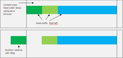
Note: Relying much on CSS3 or any other modern tricks may be a cause of concern for your website. Instead, keep the design simple. Below is an example of correct relative positioning.


Make use of Media Queries: Width conditions are critically important for a responsive design. Media queries can be used according to style and size. Besides, the clients width, you can load alternate style- sheet.

<style>
@import url(abc.css)(min-width:250 px);
@import url(def.css)(min-width:350px);
@import url(xyz.css)(min-width:450px);
</style>

Some examples according to the width are given below:

200px to 640px
@media screen and (min-width: 200px) and (max-width: 640px)
Above 640px, Landscape
@media screen and (min-width: 600px) and (orientation: landscape)
Less than 380px, portrait
@media screen and (min-width: 380px) and (orientation: portrait)

Categorize common resolutions: Common resolutions can be accommodated into 3 breakpoints:
  • Follow < 480px rule for first generation smart phone in a portrait mode
  • Follow < 768px rule for first generation smart phone in a landscape mode
  • Follow >768px rule for bigger tabs and desktops
Note: For desktops set the version above 1024px.

Are we finished yet? No, we are not! We will right back on the same blog. Keep reading for further tips on, How to achieve a responsive design?